Fans of LTG will recall that I’ve been working hard to bring the sport of darts back to Columbia in a big way. Well, truth be told even a small revitalization will be a helluva lot more than we have. With either of those ends in minds, we recently founded the Columbia Area Darts Association, or as the lazy amongst us affectionately call it, CADA.
Knowing that taking care of the important details is the first step on the road to success, I undertook the effort of having a logo designed. Lacking any relevant and necessary skills to complete such a project, I did the next best thing: I asked for bids at a website called DesignQuote.net.
Most of the bids were ridiculously expensive, but two came back with quotes that were comparatively reasonable. Unable to decide who to pick, I set them both to work. A little design competition if you will. Now, I already had a concept in mind. Back in those heady days of the 1980s when darts actually existed in Columbia the organization used this:
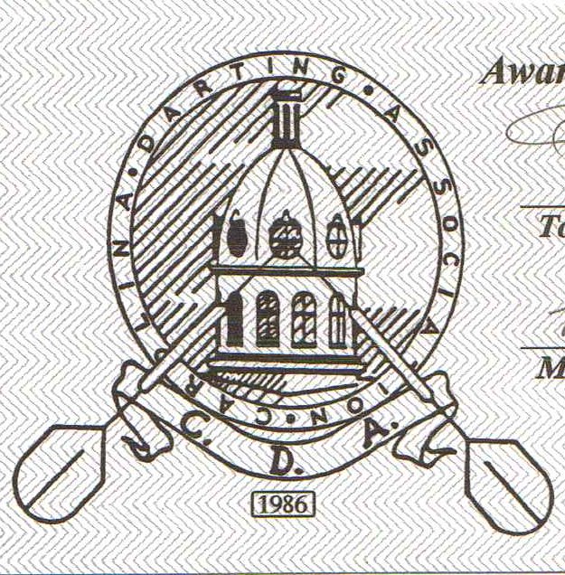
Old school graphic design. Ugly, but functional I suppose
I actually think it’s pretty damn awful. Still, Columbia is a fine city and all, but when it comes to recognizable landmarks, it’s tough to beat the State House. I just needed to pretty it up some. Here’s what I sent my designers as a starting point:
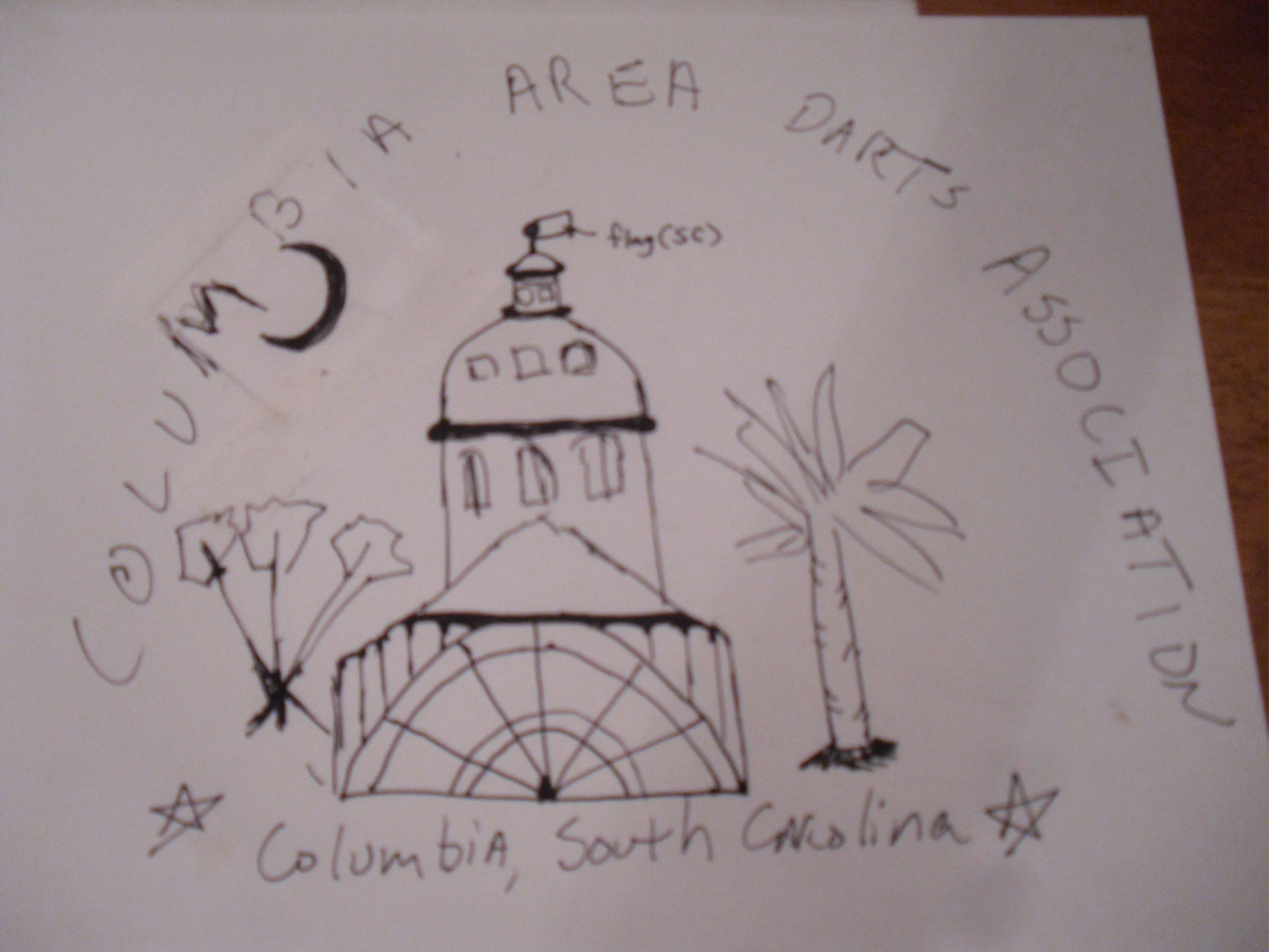
Hey, don’t laugh! I told you I had absolutely zero talent as an artist…
What the State House actually looks like:

Right smack dab in the middle of Downtown Columbia
So, the first designer offered me this:
Well, I guess you could say it is what I asked for, but it really wasn’t what I wanted. Know what I mean?
With the State House in silhouette, it could be any damn building. It was just not the “distinctively Columbia” look I was going for.
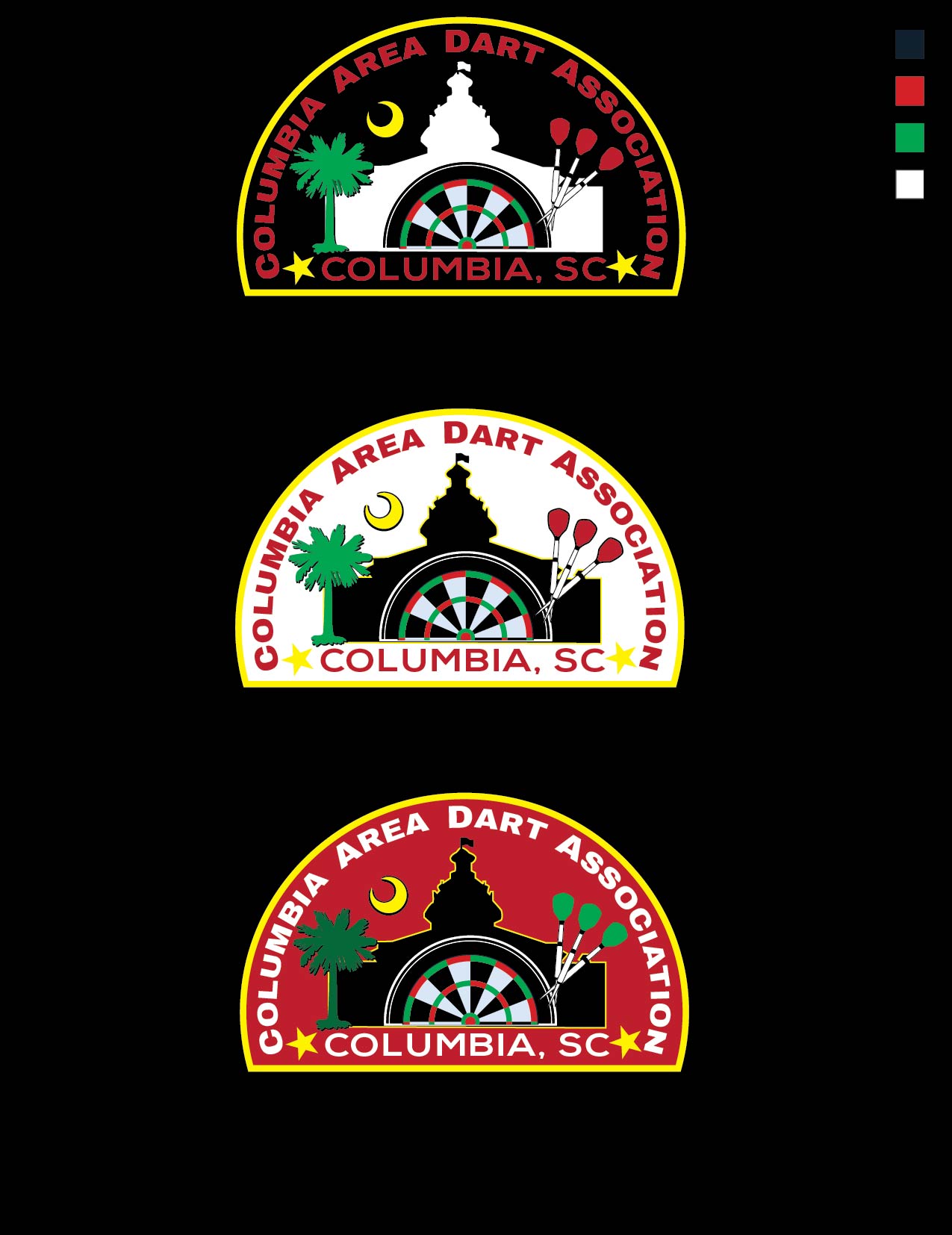
So, designer number 2 came up with this rendition:

Ah, my vision becomes reality at last!
Alright, that’s more like it, don’t you think? Not perfect, but as we used to say in the Federal government, “it satisfices”.
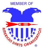
Hey, speaking of logos, did I mention that CADA is now officially a member of the American Darts Organization (ADO). Well, we are. That’s the big time, baby!
We’ve only just begun, but we are on our way!
The inclusion of the crescent moon gives all the logos a rather Muslim feel, especially when paired up with that cupola, which gives off a bit of a “minaret” vibe because of the moon. Is that what you were going for? Why is the moon there at all? Is it somehow representative of Columbia?
—Ah. I just answered my own question by Googling Columbia’s flag. It’s kinda too bad that the moon is in the original flag design. It’s very distracting. (I should note that Columbia’s official flag has no palm tree and no moon. I’m guessing the tree/moon flag is more for tourism purposes.)
Does Columbia have any other symbols to represent it? Something along the lines of, say, a dangerous predator (raptor or quadruped)?
Trivia: cada is Spanish for “each.” Ado is French slang for “adolescents/adolescence.”
Also, I see some confusion re: whether it should be “Dart [singular] Association” or “Darts [plural] Association.” I’d go with “Darts,” personally; no one “plays dart.”
Yeah, I told that designer two times to change dart to darts. In the final version she did, but I didn’t bother downloading it because I’d decided to go with the other one.
Yeah, the crescent moon makes me think of our Muslim friends as well. I used it because it and the palmetto tree are state symbols and I frankly didn’t know what else to do. And seeing as how I’ve spent the money, we are going to use it for awhile I suppose.
Well, I like that CADA has an ok meaning in Spanish. To each his own and all that. Too often when someone asks me what I scored I have to answer “nada”.
I think Designer #2’s design is indeed better than the designs from Designer #1. You’ve got a good eye. That said, you’re also right that that final design isn’t perfect. The alignment of the numbers around the circular border, for example, could be improved through a better use of Bézier curves. The concentric circles aren’t perfectly concentric (see how the numbers on the right-hand side of the outermost ring are cut off while the left-hand numbers are almost wholly visible? compare, especially, 13 and 6 to 11 and 14). Also, my inner designer is looking at that design and wondering how it would look as a military-style shoulder patch. By that reckoning, the CADA text needs to be made solid (white), not shadow-style, so as to be legible from a distance.
I also wonder whether the design might be overcrowded with symbols: palmetto, moon, state house, two dart boards, stars, a ribbon, a flag (that repeats the palmetto/moon symbolism!), etc. There’s a lot going on. I’d say that there should be no more than 2-3 symbols (or design elements) on the logo; take a look at these military shoulder patches and notice how no patch really has more than 2 or 3 dominant design elements on it. Note, too, the iconic simplicity of the backgrounds, and the power that is given to the designs by the clever use of heavy, solid borders that add force and dignity to the overall Gestalt. If I were designing your logo, I’d follow the military shoulder-patch template to produce a simple, clear image.
I hope all this doesn’t sound too harsh. I actually went through a similar process when trying to design a bumper sticker for my old “Kevin’s Walk” project. My first attempt was razzed as “too busy” by some close friends, and I now recognize the urge of any designer to throw in as much “message” as possible through the haphazard piling-on of symbols and images. The fact of the matter is that the target audience for your design is only the most local people; no one else is going to understand the symbolism, anyway, no matter how many symbols you add, so your logo should be about evoking local loyalty—it should provide something powerful for people to rally behind. In my own design adventure, I ended up tossing out my first draft completely in order to concentrate on a much more streamlined logo. And it worked—it (eventually!) got raves.
First Draft
Second Draft
Third Draft
Final Draft
Anyway, good luck as you hammer out your design. If I have time, I could try to submit something (or a few somethings) as well, and I won’t even charge you. No guarantees that my designs will be a home run, of course; art is very subjective.
What’s your timeline? When do you need a logo by?
J,
I just submitted a comment that had a few hyperlinks in it, so it’s in your moderation queue (probably as an anti-spam measure). Just a heads-up.
K
Thanks for the feedback, Kevin. And yes, I do agree that I did go overboard somewhat. Wish I had known you had the the eye and the talent for this type work, I would have commissioned you for sure. Ah well. Anyway, the horse has left the barn so to speak. I’m going with this for now, so don’t waste time on a redesign. I actually am in the process of ordering patches so I’ll be interested to see how they turn out.
Perhaps next year when absorbing the financial investment I’ve already made on design work isn’t so painful, I won’t feel so bad about abandoning this design. I’ll definitely hit you up for ideas, and I’ll have to insist on paying you for your time..
Hmm, I really enjoyed watching the iterations of your bumper sticker go through the development process. And yes, the last version was elegant in it’s simplicity, while still conveying all the information you wanted to impart. Nicely done!